Project Overview
Jackpotjoy runs paid acquisition campaigns that drive users from ads (static and video) to dedicated landing pages, where users are encouraged to register and start playing.
This project tested whether a new visual-led landing page could outperform an existing CRO-optimised control page that had been built using established best practices and prior user research.
The Problem
Jackpotjoy requested a newly designed landing page to be used in A/B testing against an existing CRO-focused page. The CRO page had been created based on user research and best practices and had already shown strong performance on Virgin Games landing pages.
However, the team wanted to validate whether CRO conventions alone were truly the best way to convert and retain players — or whether a stronger visual and experiential approach could lead to higher-quality users and greater long-term value.
The risk: Optimising purely for short-term conversion might sacrifice engagement, brand trust, and player value.
The landing page was designed to support acquisition across multiple channels, including paid social, programmatic, native, and affiliate traffic, making performance, clarity, and technical stability critical.
Objectives
- Deliver a fully redesigned landing page for A/B testing
- Ensure excellent performance across mobile and desktop devices
- Improve readability, performance, and SEO outcomes
- Achieve strong alignment with the new Jackpotjoy brand identity
- Reduce reliance on heavy assets to ensure the page is fast, stable, and reliable
My Role
I owned the entire challenger experience end-to-end:
- User behaviour research
- Visual design
- UI design
- HTML / CSS
- JavaScript implementation
- Experimentation support
I worked independently to design, build, and deploy a new landing page to be tested against the CRO control.
Users & Journey
User flow:
Ad (static or video) → Landing page → Registration → Gameplay
The users were acquisition traffic arriving from paid campaigns.
They were deciding, within seconds, whether Jackpotjoy felt:
- Trustworthy
- Exciting
- Worth registering for
The landing page had to do more than convert — it had to create confidence and motivation to play.
Control vs Challenger
Control (CRO landing page)
- Built by another designer
- Based on CRO best practices
- Informed by previous A/B tests and user research
- Optimised primarily for form completion and short-term conversion
Challenger (my design)
- Visual-led, brand-driven approach
- Designed to improve engagement, clarity, and perceived value
- Built to encourage not just sign-ups, but higher-quality players
Design Analysis
During analysis of existing Jackpotjoy landing pages, several challenges became apparent:
- The new Jackpotjoy branding is significantly more fun and playful than the previous, more elegant identity, creating a risk that existing users might not immediately resonate with the change.
- The branding concept emphasises freedom and randomness, but available brand assets were limited. Without careful control, this could easily result in a chaotic or visually overwhelming design.
- Existing landing pages were designed only for two breakpoints (desktop and mobile), resulting in poor responsiveness on intermediate screen sizes.
- Too much visual emphasis was placed below the fold, while the first rendered screen — the most critical moment for user engagement — was underutilised.
Because I handled both the design and development, these issues could be addressed holistically.
Design Approach
As the sole designer and developer, rather than focusing purely on form and efficiency, I approached the project with equal emphasis on visual clarity, usability, and technical performance:
- Visual hierarchy — guiding users from offer → benefits → trust → action
From the outset, I aimed to strip away unnecessary elements that could negatively impact load times and stability. Particular emphasis was placed on the first rendered screen, as this is where users form their initial impression and decide whether to continue engaging.
- Brand expression — making Jackpotjoy feel premium and safe
- Emotional engagement — excitement, rewards, momentum
- Clarity — reducing friction through layout and typography
I deliberately avoided adding decorative elements further down the page, as these could delay loading and increase the risk of users abandoning the experience before scrolling.
- Performance — fast-loading, responsive HTML/CSS builds
Given that the integrated Jackpotjoy codebase can be technically fragile, I adopted a “less is more” philosophy — prioritising simplicity, performance, and reliability to minimise rendering issues across devices, browsers, and platforms.
Key decisions
I used insights from user behaviour to:
- Prioritised first-render performance to maximise immediate engagement and reduce early drop-off
- Adopted a restrained visual strategy, reducing heavy assets to improve speed and stability — a key factor where users often hesitate
- Controlled use of the new brand language, balancing playfulness with structured layouts to reinforce trust and value
- Designed beyond basic breakpoints, ensuring consistency across intermediate screen sizes
- Kept the core offer visually dominant, simplifying hierarchy and reducing cognitive load
- Created two compositional variants (centred and offset) to test layout impact on engagement
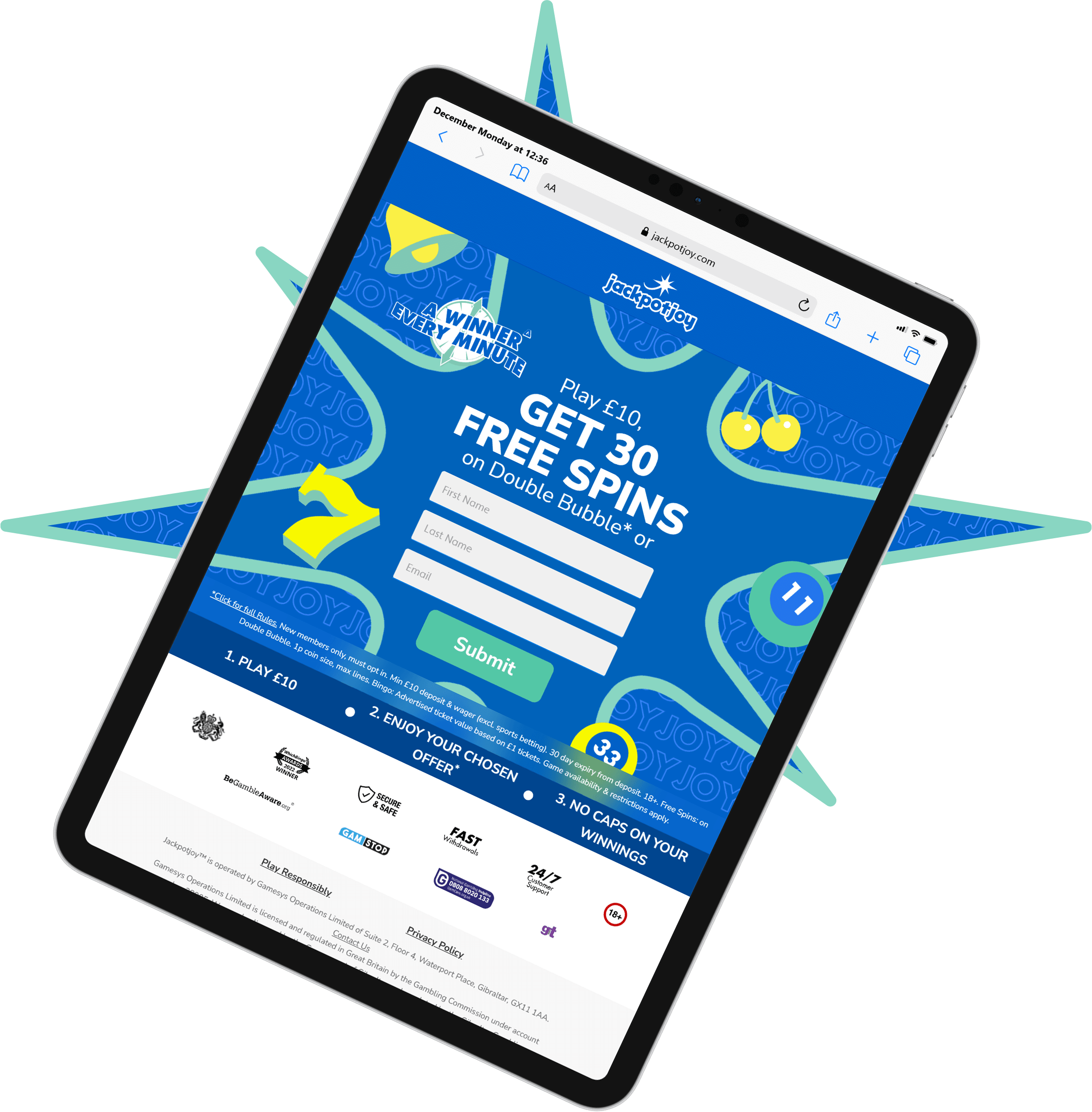
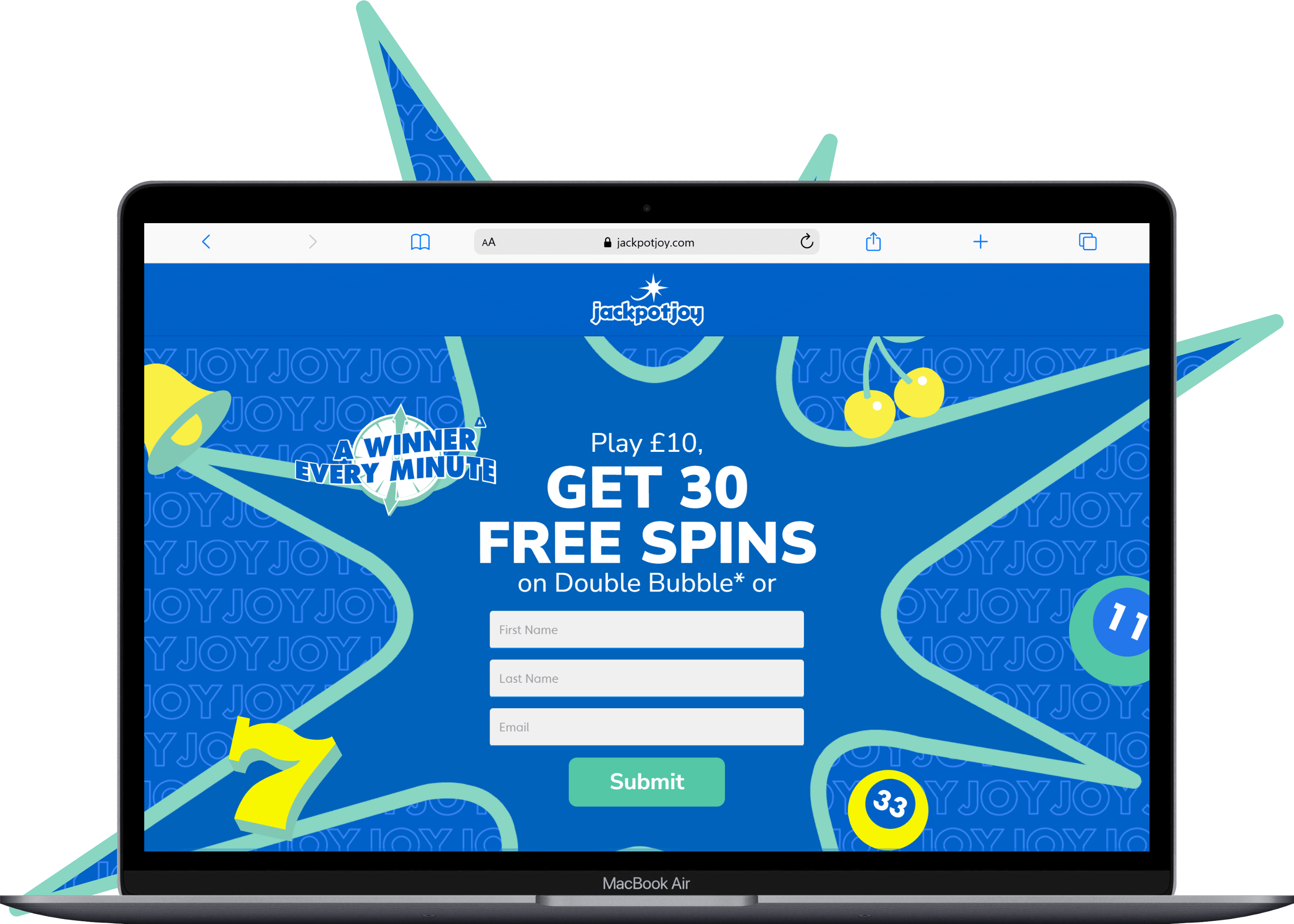
Branding Decisions
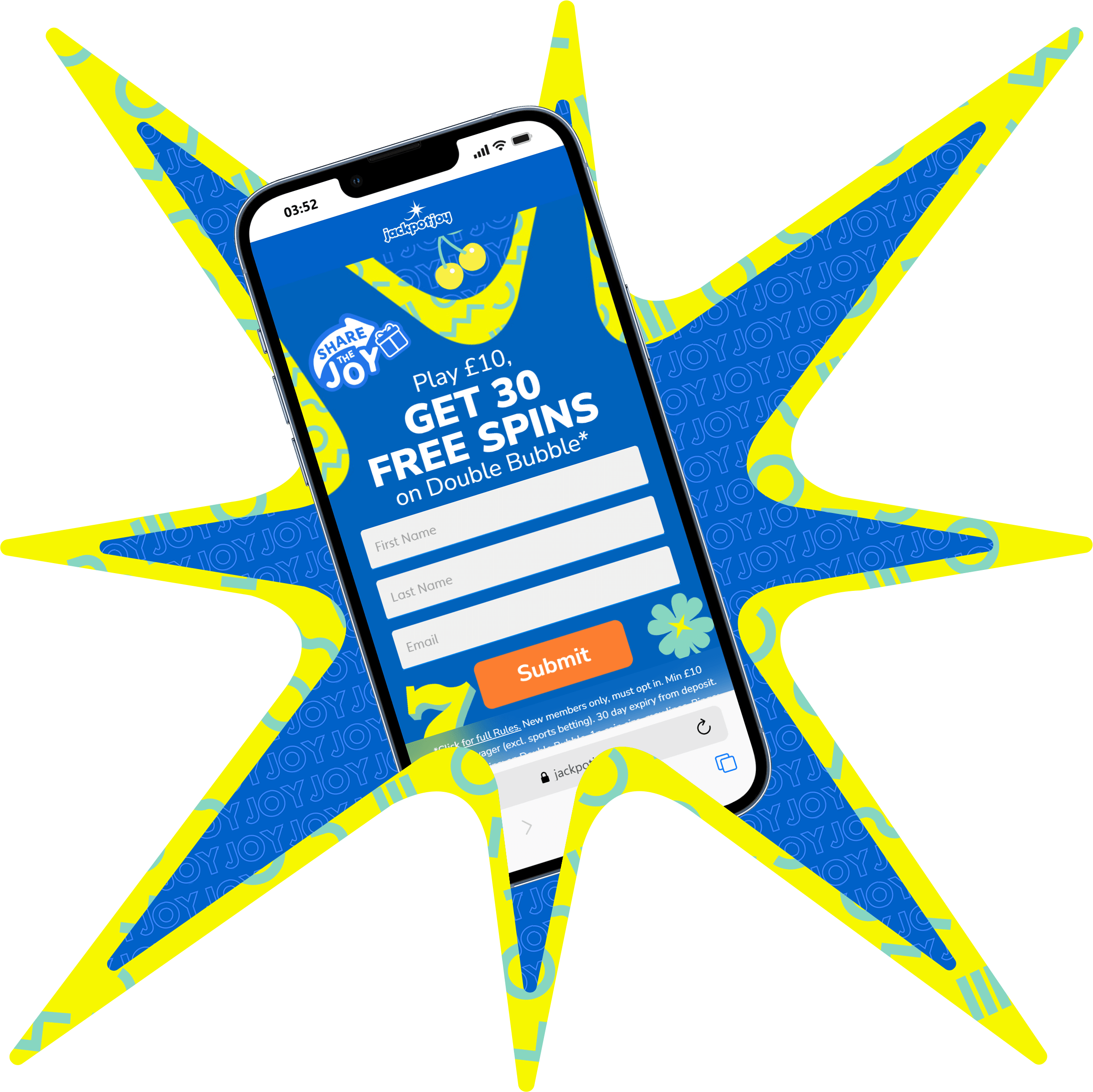
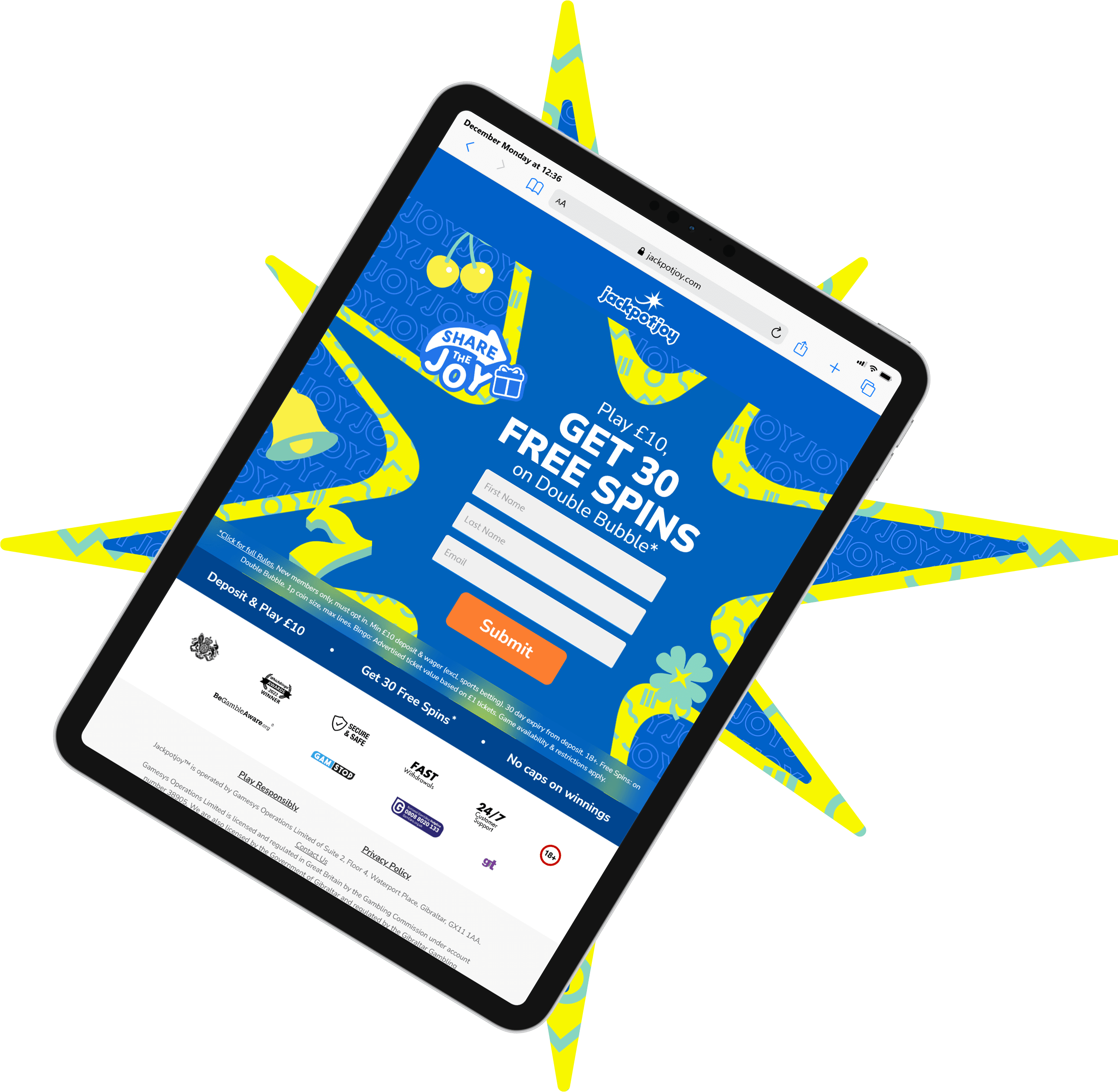
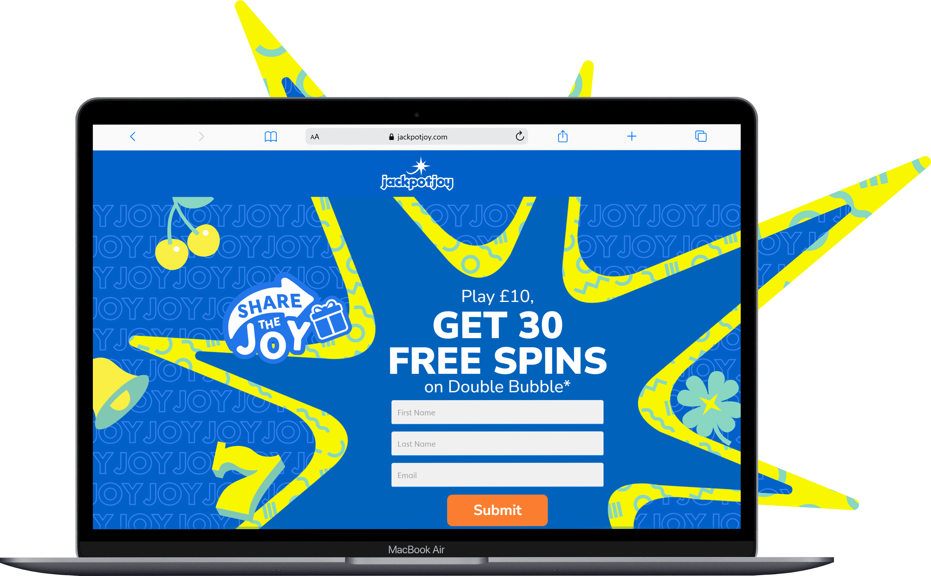
To integrate the new brand identity, I used the Jackpotjoy blue JOY pattern as the primary background, combined with the signature Jackpotjoy star.
Two visual directions were explored:
- Version A: A centred composition featuring a simplified, single-stroke Jackpotjoy star as the focal point
- Version B: A slightly left-aligned composition using multiple stars arranged in an irregular stroke, paired with high-contrast yellow accents and an additional Jackpotjoy pattern
Although the new branding includes a wide and vibrant secondary colour palette, I intentionally focused on signature blue, supported by bright yellow and balanced with turquoise. This preserved the playful spirit of the brand while preventing visual overload.
As the branding was still relatively new and asset availability limited, I introduced subtle supporting symbols — such as bingo balls, clovers, and the classic “7” slot icon — to clearly communicate themes of online games and entertainment.
Messaging & Content Hierarchy
User research showed that the main bonus offer performed particularly well when paired with paid advertising. As a result, the primary message was kept deliberately simple and prominent.
- Bold, uppercase headline typography for clarity
- White text on darker blue background for contrast and accessibility
- Registration fields positioned to immediately attract attention
- Secondary messaging reduced in size and weight to support the primary message
Responsive Design & Technical Implementation
To address responsiveness issues in earlier designs, the page was built across multiple screen breakpoints, not just desktop and mobile.
I implemented:
- Flexible layout logic
- Responsive CSS values
- CSS pseudo-classes
This ensured consistent presentation and functionality across a wide range of devices, browsers, and platforms.
Why It Worked
- Faster load times improved early engagement, especially on mobile and programmatic traffic
- Clear hierarchy reduced cognitive load, making the value proposition instantly understandable
- Brand evolution felt intentional and controlled, rather than chaotic or overwhelming
- Responsive consistency improved usability across devices
- Design decisions were data-informed, grounded in proven CRO insights from previous campaigns
Final Solution
The final experience was a fully built landing page that:
- Faster and more responsive, optimised for real user behaviour rather than rigid CRO rules
- Technically stable across devices and browsers
- Fully aligned with the new Jackpotjoy brand identity
- Clearer in how it presented offers
- More immersive and premium in feel
It was deployed into an A/B test directly against the CRO control.
Impact & Performance Results
In A/B testing, the new design outperformed the CRO best-practice page across multiple acquisition KPIs, demonstrating that a visual-led approach can generate better players, not just more clicks.
Compared to the CRO control:
- +16 and +12 additional players acquired
- +4% and +10% uplift in IMM
- More than 2× higher projected player value
- Winning landing page selected following A/B testing
Despite being built around traditional CRO best practices, the control page failed to deliver comparable commercial value, while the visual-led experience produced significantly higher-value players.
These results indicate improved acquisition quality, engagement, and overall campaign effectiveness compared to the established CRO benchmark.
All design and development decisions were implemented and tested within live acquisition environments.
Why This Matters
This experiment proved that: Optimising for experience and brand can outperform pure CRO tactics in long-term business value.
The project validated visual design as a strategic lever, not just decoration.
What I’d Improve Next
With more time, I would:
- Test multiple visual styles within this framework
- Run deeper segmentation (e.g., mobile vs desktop, new vs returning users)
- Use the learnings to evolve a scalable landing-page design system
©2025 Khuyen Le Thi Minh