Project Overview
Virgin Games regularly runs social media mini-games and promotions.
To participate, users must read a Terms & Conditions (T&Cs) page that explains how to enter, what prizes are offered, how winners are selected, and when results are announced.
This page is a critical trust and compliance touchpoint — it has to be clear for users and efficient for internal teams. The new version also needed to be lightweight, fast-loading, responsive, and fully aligned with updated visual guidelines.
The entire project — from early concepting and UX decisions to visual design, development and final implementation — was designed and built by me end-to-end.
The previous design and development did not follow a strong visual direction and had not been optimised for performance, resulting in a page that felt outdated, inconsistent and slow. My goal was to rebuild the experience from the ground up and modernise both the user-facing and internal processes.
Objectives
- Deliver a fully redesigned and rebuilt Terms & Conditions page
- Ensure exceptional performance across mobile and desktop
- Improve readability, typography and accessibility
- Achieve strong brand alignment with the new Virgin Games identity
- Introduce an automated workflow to replace manual updating
- Reduce reliance on heavy assets and outdated tools
Design Challenges
The existing T&Cs page was fundamentally broken from a UX and brand perspective:
- No cohesive visual system
- PNG-heavy assets and slow load times
- Poor scalability on modern high-resolution screens
- No typographic hierarchy made long legal text impossible to scan
- Text touched the edges of containers with no margins
- The design didn’t reflect Virgin’s premium brand
- Each new promotion required manual editing in Dreamweaver, making updates slow and error-prone
- Outdated development practices with no optimisation
This created:
- User confusion
- High risk of mistakes
- Hours of unnecessary work for stakeholders
Because I handled both the design and development, these issues could be addressed holistically.
Users & Journey
User flow: Social media mini-game → T&Cs page → Participation
Users came from Facebook, Instagram, and other social platforms after playing a mini-game. They needed the T&Cs page to quickly answer:
- How do I enter?
- What’s the prize?
- When will winners be announced?
- Am I eligible?
If this page felt confusing or untrustworthy, users would abandon the experience.
Constraints
- Legal content could not change
- The page had to be extremely fast and lightweight
- It had to fit Virgin’s brand guidelines
- No heavy graphics could be used — the solution had to rely on layout, typography, and structure

My Role
I owned the project end-to-end:
- User research
- UX & UI design
- Stakeholder alignment
- Workflow redesign
- Implementation (HTML/CSS)
- Testing and rollout
I also proposed a new way of working that removed manual editing from the process.
Research & Insights
I identified two major problems:
For users
- They needed to scan for key information, not read walls of text
- They needed clear structure to understand rules quickly
For stakeholders
- Updating T&Cs took hours
- They had to open files in Dreamweaver, manually change content, and risk mismatching information
The solution had to serve both groups.
UX & UI Strategy
As the sole designer and developer, I approached the project with equal focus on aesthetics, usability and technical performance:
- Strong visual hierarchy (titles, sections, spacing)
- Readable typography
- Consistent layout
- Modular structure that could be reused
Instead of treating T&Cs as a static document, I designed it as a structured information system.
Creating a Lightweight Architecture
To achieve fast load times, I eliminated unnecessary image assets and replaced essential elements with SVGs for sharper rendering and lower file weight.
Branding Decisions
Integrating Virgin Identity
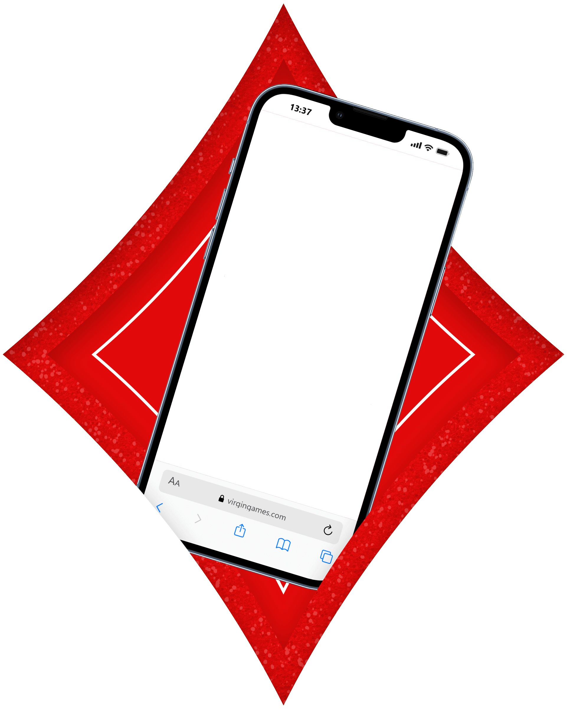
I updated the background to Virgin’s signature red, creating a strong brand presence. The white-on-red typography delivers high contrast, strong personality and improved readability.
Modernised Header & Logo
The old PNG banner was replaced with an SVG version of the new Virgin Games logo, along with a clean dividing line.
This improved loading speed, visual clarity, and brand consistency.
Content Layout Improvements
Improving Readability
Enhancements included:
- Bold section headers
- Clear indentation and hierarchy for lists
- Better spacing and grouping of paragraphs
- Stronger typographic structure
These changes make dense legal content significantly easier to navigate.
Iconography & Visual Refinements
Reworking the Footage Logos
All footage provider logos were previously low-quality PNGs.
- I recreated them as vectors
- I placed them in Virgin's diamond shape for brand cohesion
- I added hover interactions for clarity and usability
The result is a cleaner, faster, and more polished visual presentation.
Workflow Automation Improvements
Identifying Inefficiencies
Through discussions with the brief owner, I discovered that the team’s workflow was entirely manual. Every new T&C page required opening HTML in Dreamweaver and manually replacing repeated fields — a slow and error-prone process.
My Own Initiative: JSON-Based Automation
Although not requested in the initial brief, I proactively proposed a more efficient system.
I redesigned the structure so all editable information is stored in a JSON file, and the page dynamically pulls this content using lightweight JavaScript.
This solution:
- Eliminates manual search-and-replace errors
- Allows updates in minutes instead of hours
- Makes the workflow accessible to non-technical staff
- Removes the need for Dreamweaver subscriptions
- Adds virtually no load time to the page
This initiative significantly improved the team’s operational efficiency and future-proofed the page’s maintenance.
Outcome & Impact
The final page is:
- Faster and more responsive thanks to vector assets and optimised development
- Fully aligned with the new Virgin Games brand identity
- Far more readable, with improved hierarchy and structure
- Technically modern, using clean, efficient HTML/CSS/JS
- Easier to maintain, with an automated content system
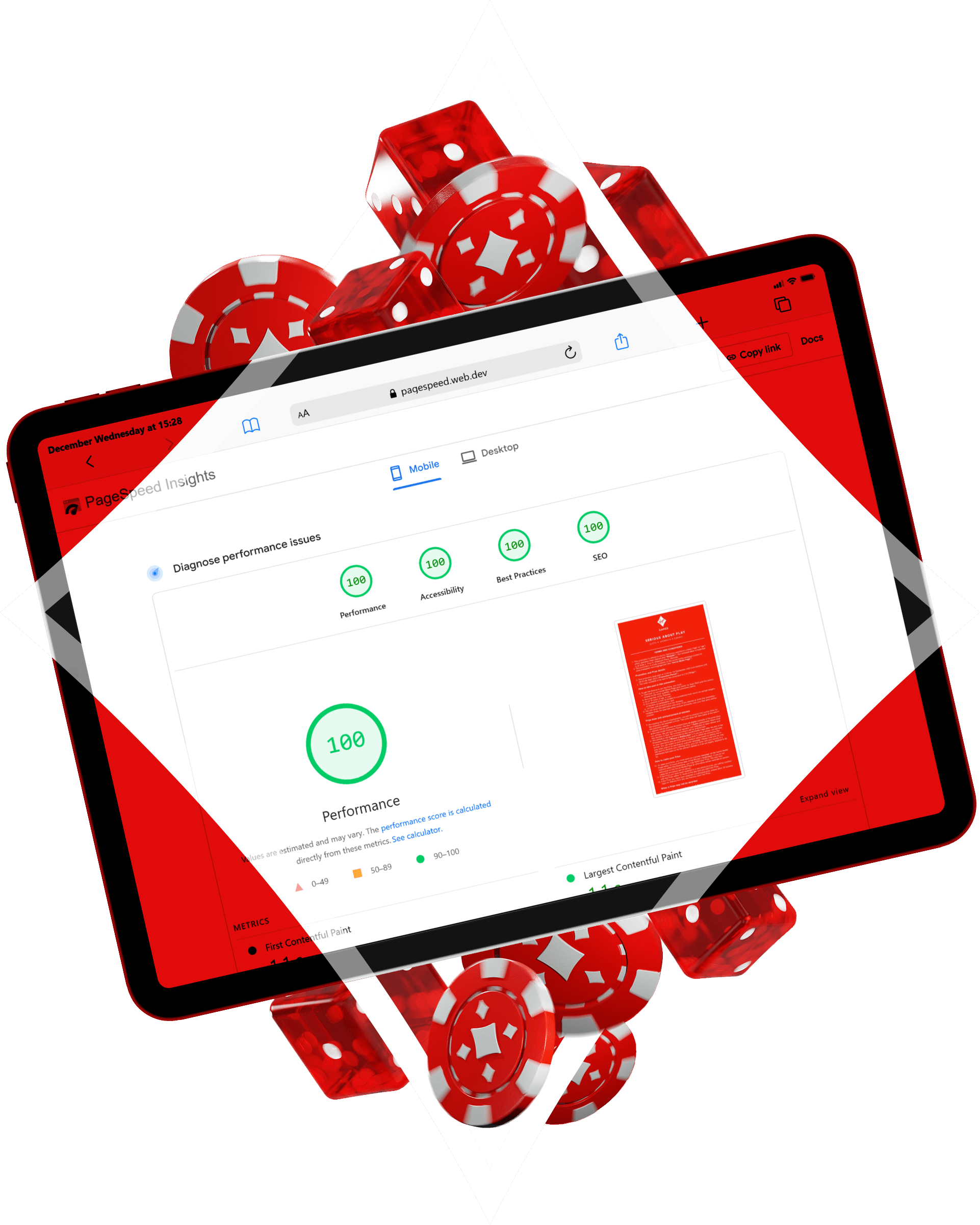
Performance Results
The rebuilt page achieves exceptional performance on Google PageSpeed Insights:
- 100% Performance
- 100% Accessibility
- 100% Best Practices
- 100% SEO
on both Mobile and Desktop.
These results validate the success of the lightweight architecture and design decisions.
Workflow Impact
Brand managers now update promotional information quickly, accurately and without technical tools. Creating a new T&Cs page went from hours to minutes
No more Dreamweaver and no more manual editing of long text files. This eliminates workflow bottlenecks, reduces risk of mistakes, and decreases operational costs.
User experience
- Clear hierarchy
- Easier scanning
- Faster understanding of rules, prizes, and eligibility
This turned a risky, frustrating process into a fast, reliable, and scalable system.
Why This Matters
This project shows how UX, visual design, and systems thinking can:
- Reduce operational cost
- Lower risk
- Improve user trust
- And scale across an organisation
It wasn’t just a redesign — it was a product and workflow improvement.
©2025 Khuyen Le Thi Minh